Fictional Concept Study
EICHWERK
A cinematic one-page identity for a premium regional home builder — our study in turning a trade into a house brand people trust before they call.
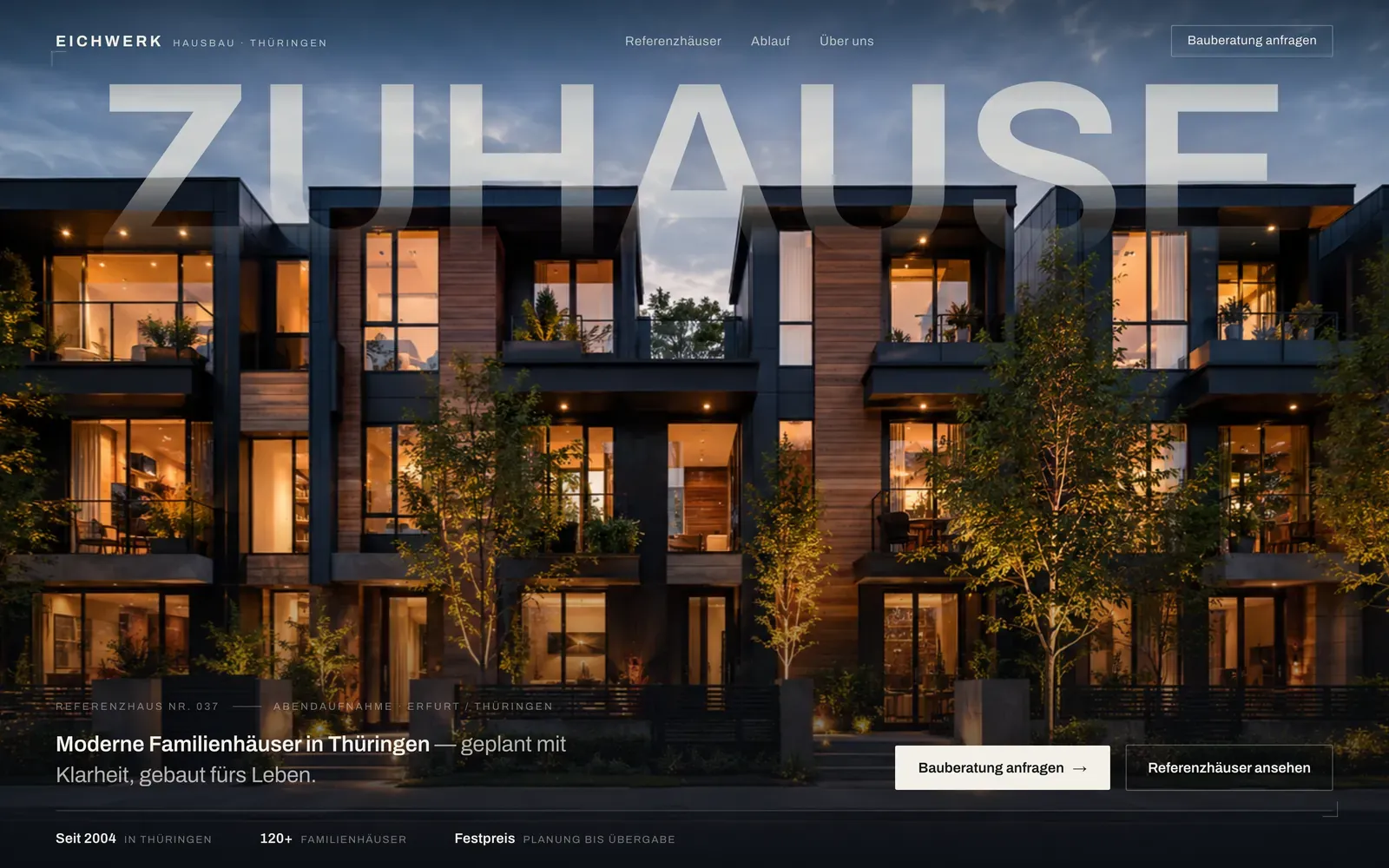
01 Overview
A regional builder's work is the most expensive thing a family will ever buy. The website selling it is usually a brochure PDF, a stock photo and a form — so the work has to survive the first impression instead of making it.
Premium builds behind budget websites. A family compares two firms, sees the same stock houses and the same beige promises on both, and picks on price — which is the one contest good work loses.
So we set the brief ourselves and built the other version: one page, one light, and every claim tied to something you can see. It looks like the houses cost what they cost.
EICHWERK isn't a real company. It's a design study — the brand, its reference houses and its client voices are invented to explore an idea, not to stand in for a client.
- Type
- One-page website
- Industry
- Home builder
- Role
- Concept · Art Direction · Web Design · Build
- Format
- Desktop + Mobile
- Year
- 2026
- Status
- Fictional Concept Study
02 Art Direction
EICHWERK lives in one light. Every frame is the same blue hour — warm windows, no people, one grade — so the brand reads as authored, not assembled from a stock library.
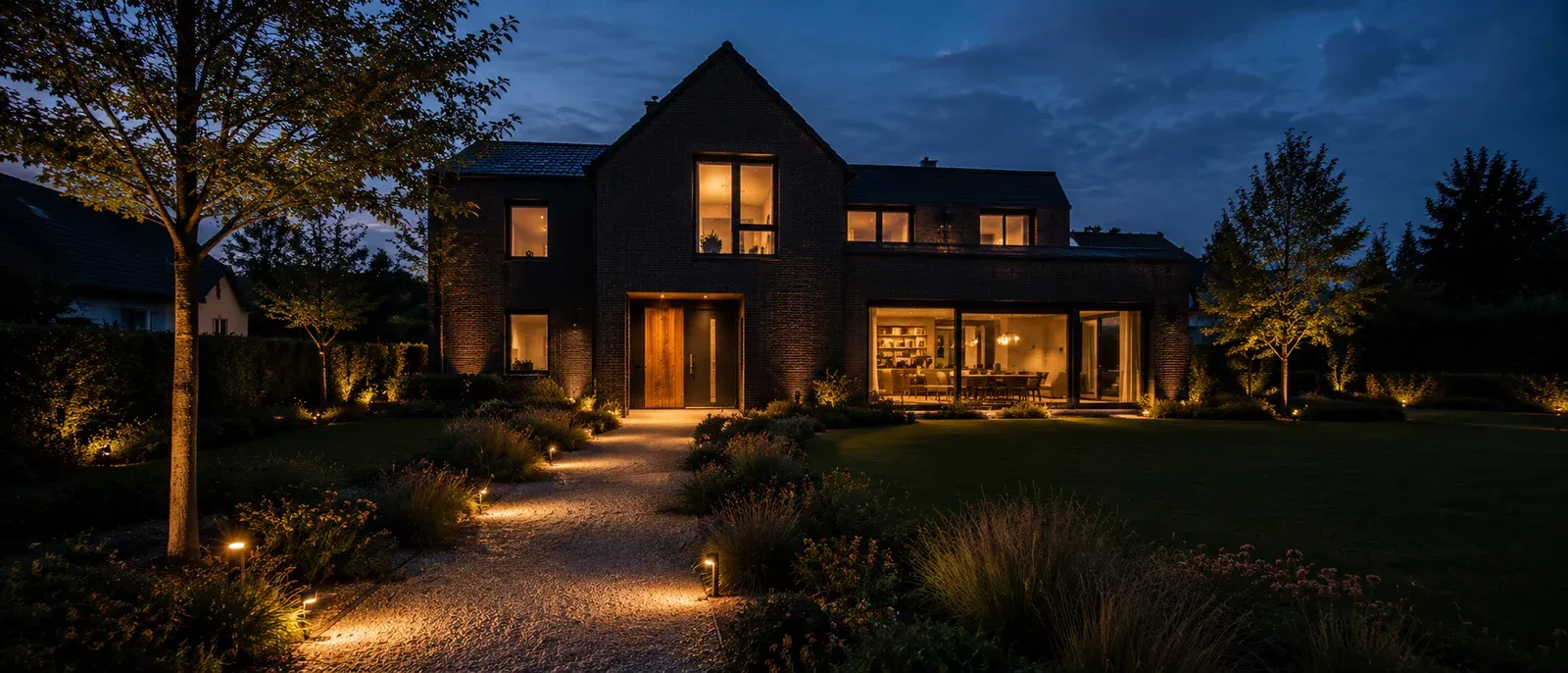
The whole world is shot at dusk. A single light turns separate photographs into one evening, and the site plays like a film instead of a catalogue.
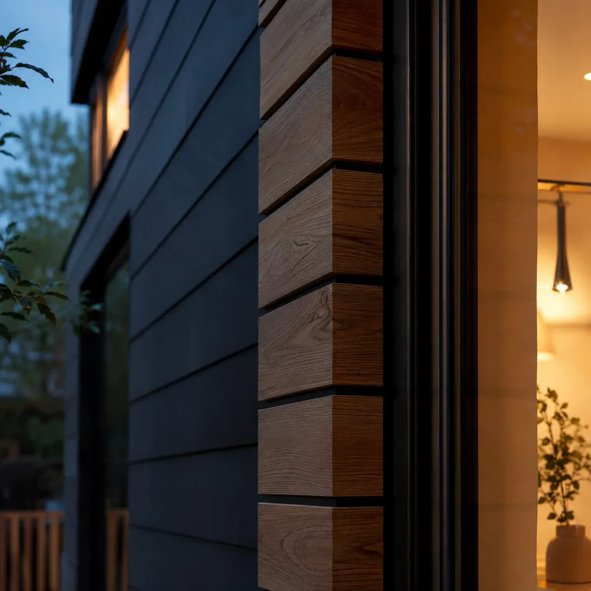
The camera goes close to what's real — charcoal cladding, warm timber, black-framed glass. Quality reads before a word does.
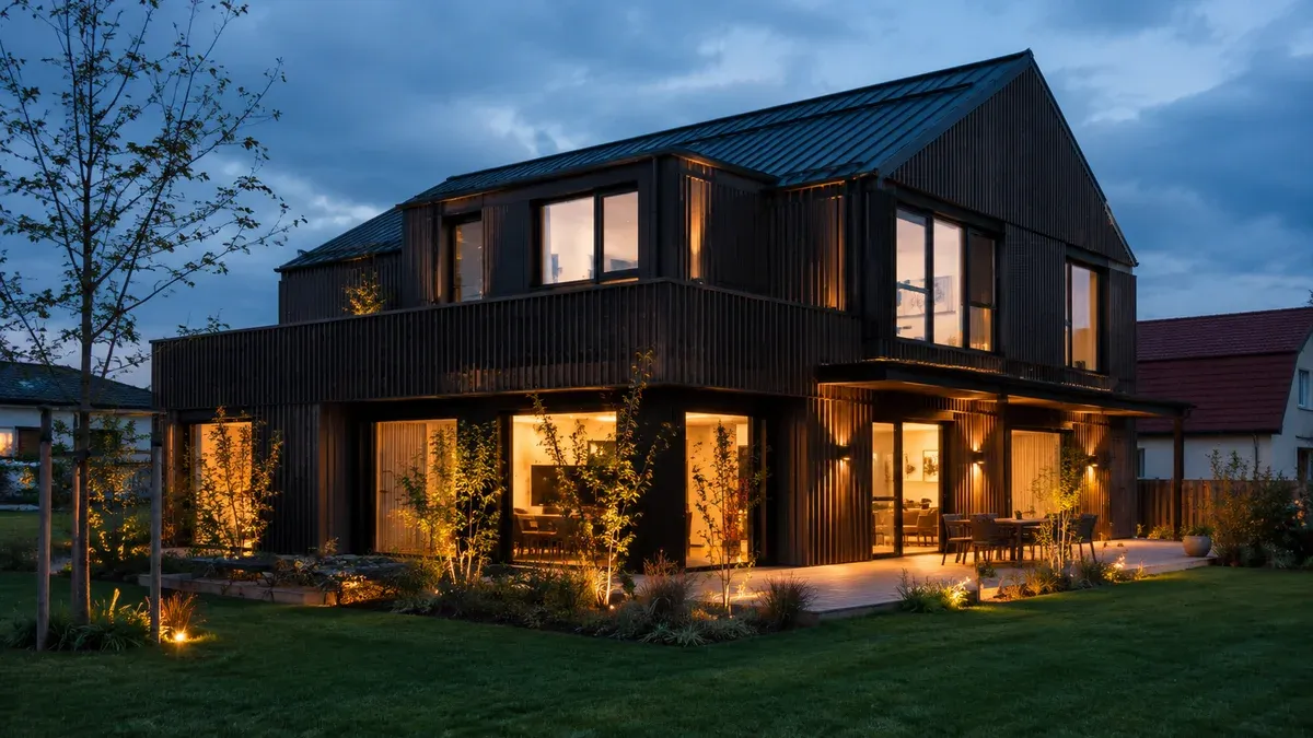
The build stays the hero — shown whole, warm from within, settled into its garden. We frame the work as a place to live, not as a mood board.
03 Type & Colour
One typeface and four tones do the whole job. Archivo carries every word, and the palette isn't chosen — it's lifted out of the photograph.
Four tones carry the whole world: a cool night, cream light, the amber of a lit window, and the hairlines that hold it together. Warm windows against a cool night — that contrast is the brand.
- Night sky & facades #0E1116
- Cream wordmark & type #F4F0E7
- Amber light in the windows #E6A55A
- Hairline rules & structure rgba(244,240,231,.16)
One typeface, four jobs. The hierarchy comes from weight and scale, not from a second font — one voice, held with discipline.
- EICHWERK Archivo · 700 · Wordmark
- Wir bauen das Zuhause einer Familie. Archivo · 600 · Headline
- REFERENZHAUS NR. 037 Archivo · 500 · Uppercase label
- Ein Haus ist kein Produkt von der Stange. Es ist der Ort, an dem Kinder aufwachsen, Entscheidungen reifen und Alltag entsteht. Archivo · 400 · Body
04 Desktop
One page, in the order a family actually decides: show me what you've built, prove nothing goes wrong, let me hear from someone like me, then ask me once.

-
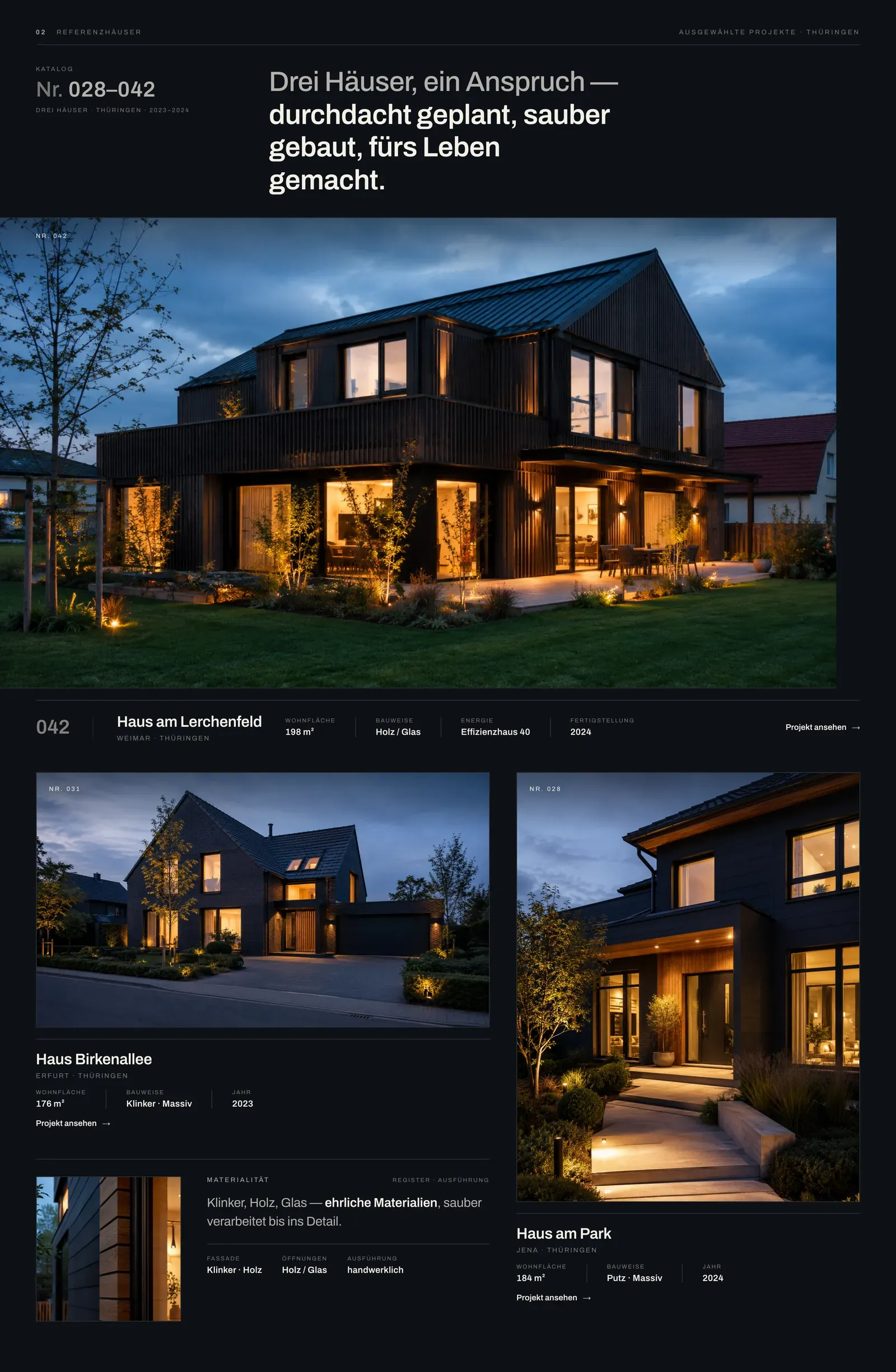
01 Referenzhäuser
We turned a project list into a catalogue. Every build carries a number, a town and a spec row — so the work reads like a portfolio of houses, not a photo gallery.
-
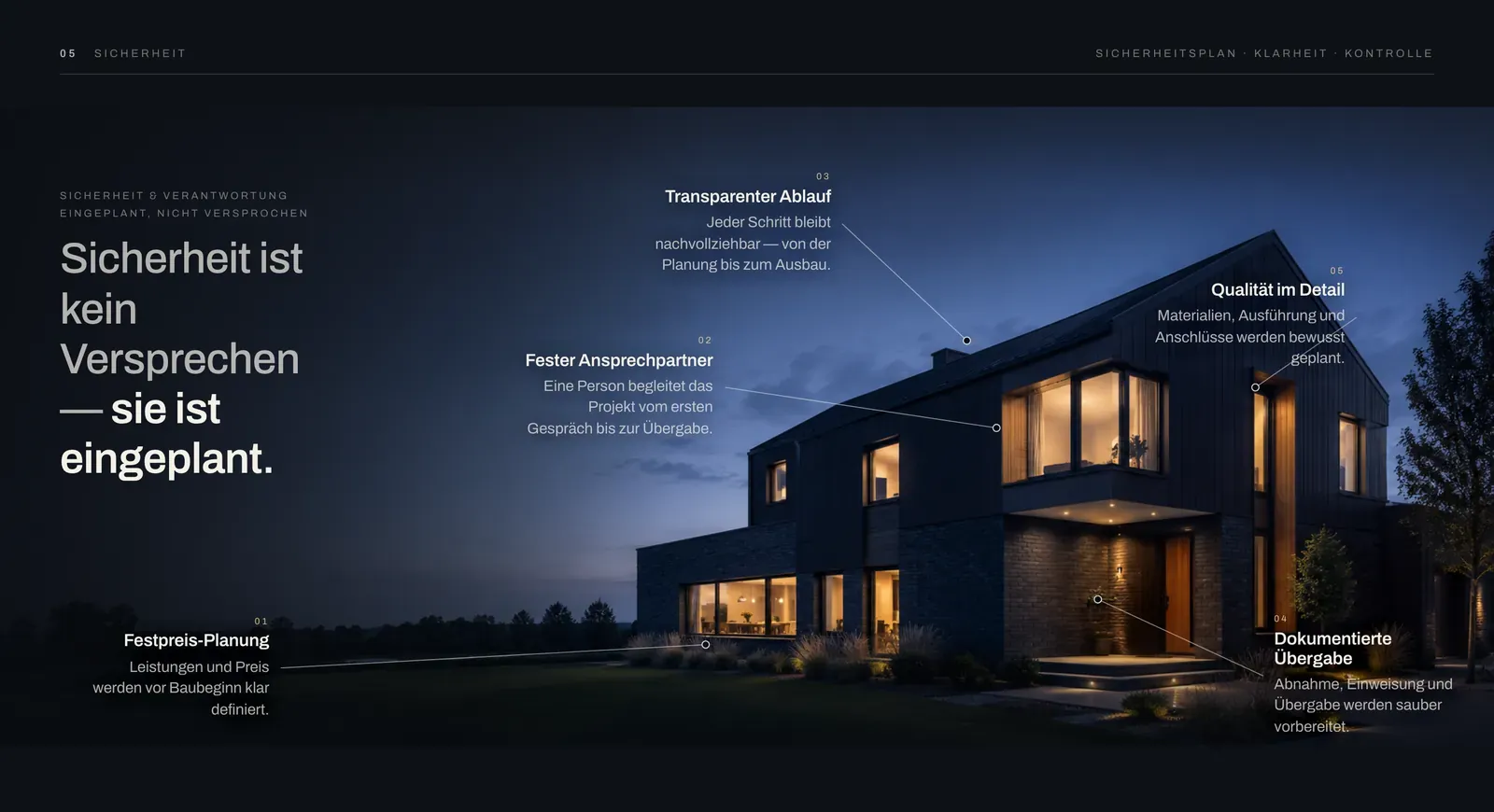
02 Sicherheit
Five guarantees pinned to the building itself. Leader lines map each one to a real part of the house — trust as information design, not a grid of icons.
-
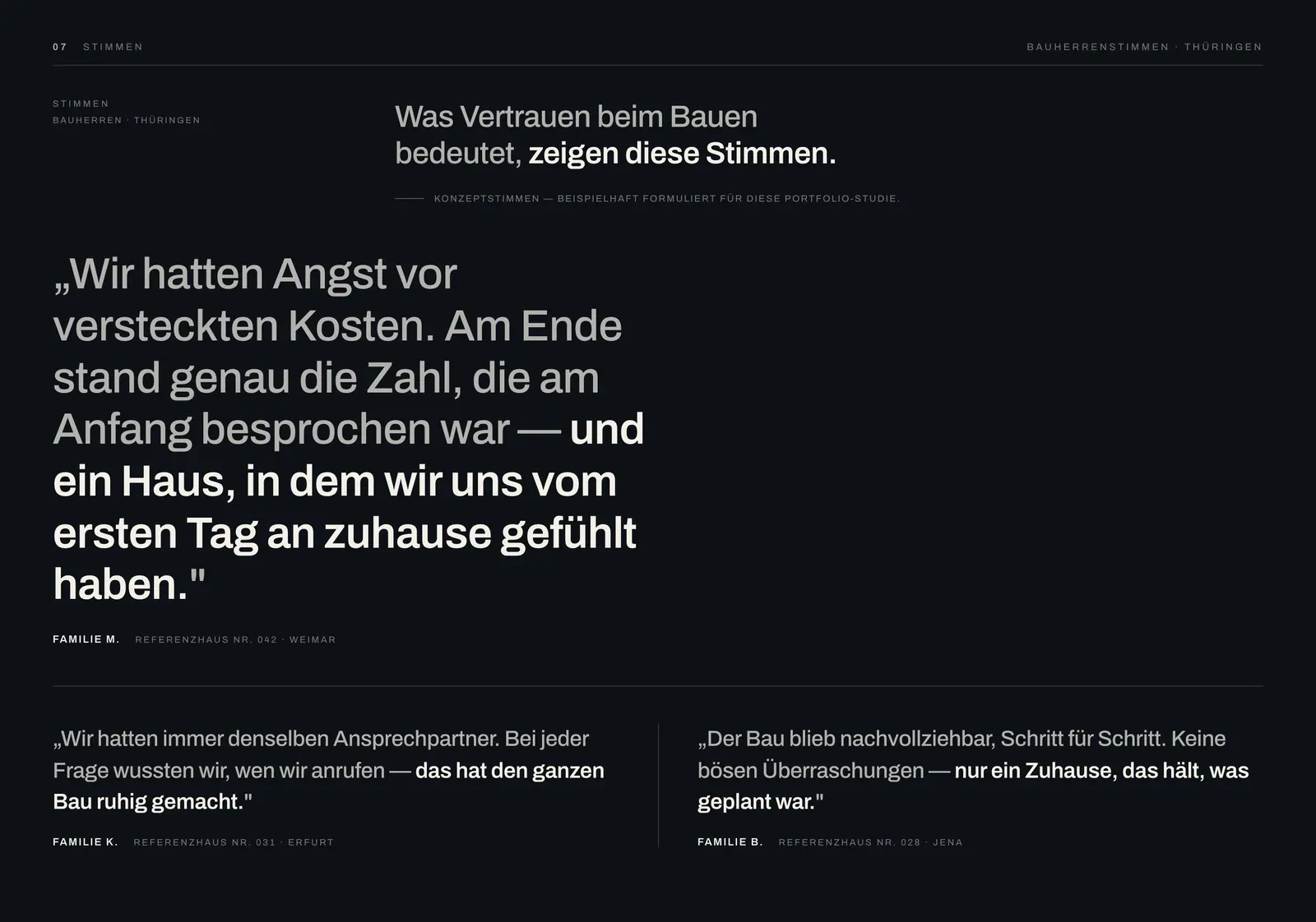
03 Stimmen
One family's sentence, set at the size of a headline. A builder's best proof is a person who already went through it — so it gets the scale, not a widget in the footer.
-
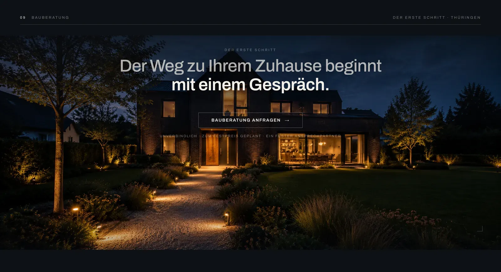
04 Bauberatung
The whole page narrows to one quiet request. A single button on a full-bleed dusk scene — no form wall, no noise, just the first step.
05 Mobile
Builders get found on a phone, at a kitchen table, late. A narrower screen isn't a smaller story: the same light and type hold, and the ask stays one button.
-
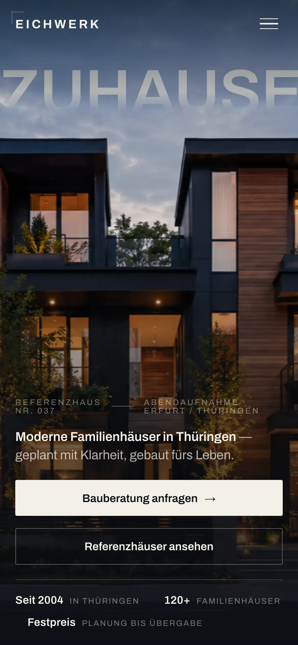
01 Der Einstieg
The masthead survives the shift — Archivo and blue hour intact, and the wordmark still holds its weight at 390px.
-
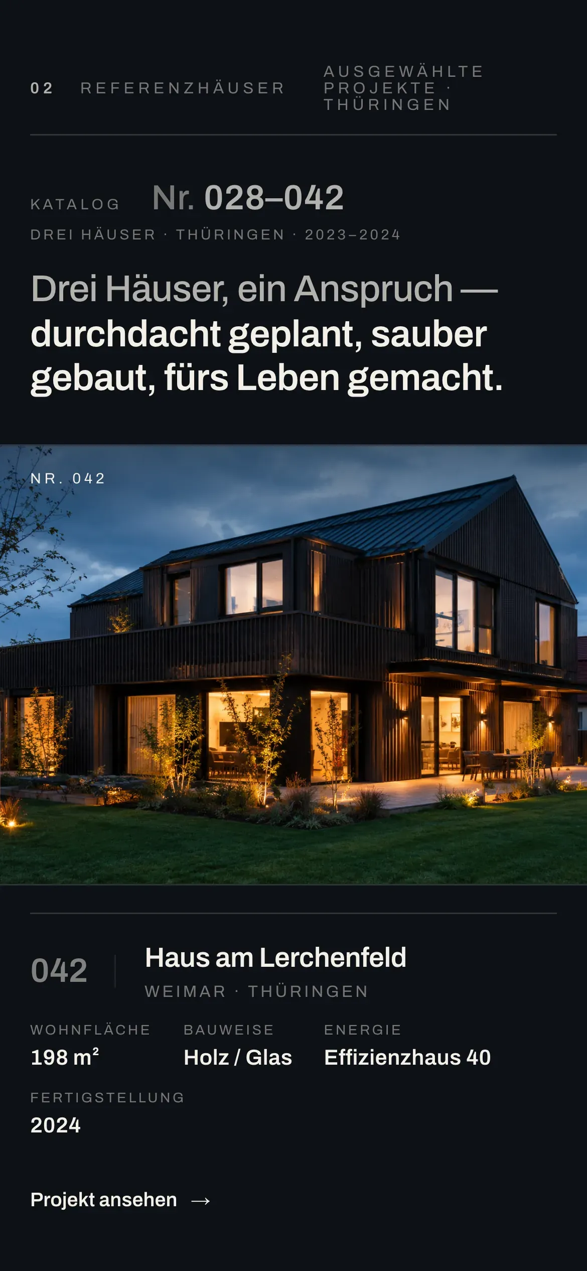
02 Der Katalog
The catalogue folds into one column and the cards keep their order — number, place, spec row — so a house still reads like a portfolio entry.
-
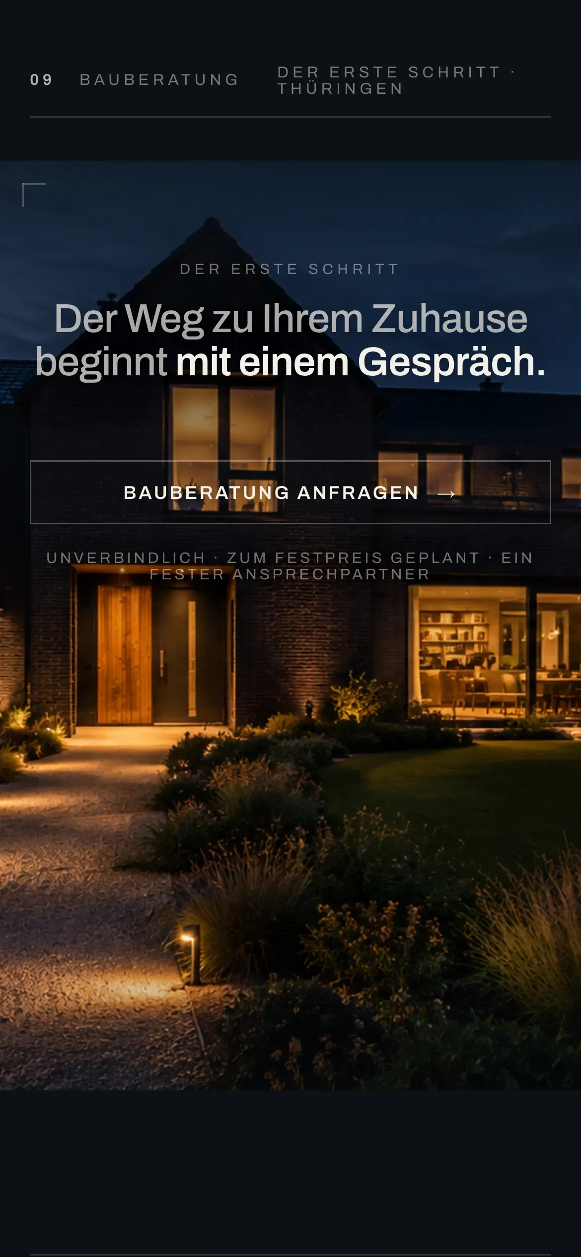
03 Die Anfrage
The close doesn't multiply on mobile. One headline, one button, one reassuring line — the same discipline, thumb-width.
Same brand, one hand — nothing dropped to fit the phone.
06 The Craft
EICHWERK isn't real. The craft behind it is.
This is how SYNCUP turns a regional trade into a brand a family trusts with the biggest decision they'll ever make.
Everything you just scrolled — the light, the type, the way each promise is tied to something you can see — is what we bring to a real builder. Yours would carry your houses, your guarantees and your name.
EICHWERK is a fictional home builder — a design study by SYNCUP Agency. The company, its projects and the families quoted on it are invented and don't represent a real business.