Fictional Concept Study
Aurelia
A one-page site for an aesthetic cosmetics studio — our study in treating a deep field colour and a single gold accent as a discipline, not a decoration.
01 Overview
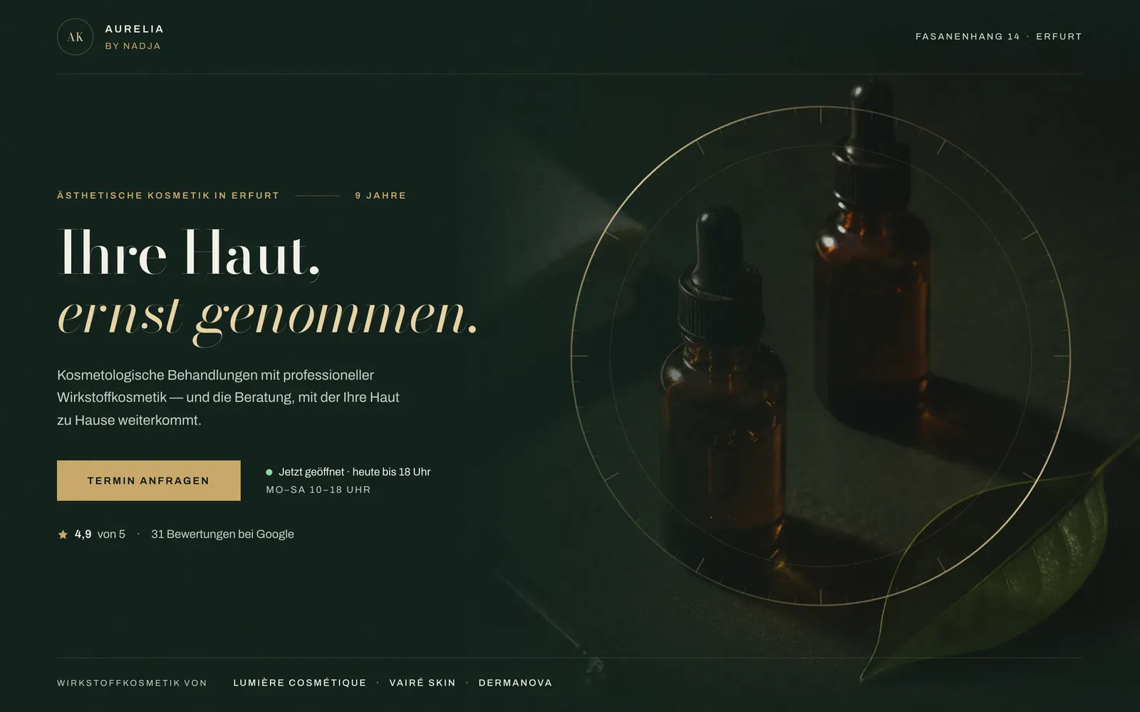
A cosmetics studio's website almost always defaults to spa cliché — soft pastels, generic wellness stock, a colour with no discipline behind it. Aurelia is our study in doing the opposite: one serious colour, one accent used exactly once as a fill, and a photograph that dissolves into the page instead of sitting on it as a rectangle.
Most studio sites either go clinical-white or soft-pastel-spa, and both read as generic within a second — nothing about the page argues for the owner's own hand and years of practice. A photograph gets bolted onto the layout as a rectangle, the tell of a template, instead of belonging to the page it sits on.
So we took an apothecary as the reference instead of a spa: a deep bottle-green field taken as seriously as a real product's own packaging, gold that only ever appears as engraving — hairlines, small caps, an instrument bezel drawn over the hero photograph — and exactly one gold fill on the page, the primary action. The still-life photograph bleeds off three edges and dissolves into the green through a masked edge, so there's no seam between photograph and field to see.
Aurelia isn't a real studio. It's a design study — the owner, the studio, the address and every figure on the page are invented to explore an idea, not to stand in for a client.
- Type
- Website · 3 pages
- Industry
- Cosmetics studio
- Role
- Concept · Art Direction · Web Design · Build
- Format
- Desktop + Mobile
- Year
- 2026
- Status
- Fictional Concept Study
02 Art Direction
One still-life, three readings — the amber bottles that anchor the hero, the hands mid-treatment that carry the craft, and a lit texture crop that becomes the signature instrument-bezel disc, read at different distances instead of restaged three times.
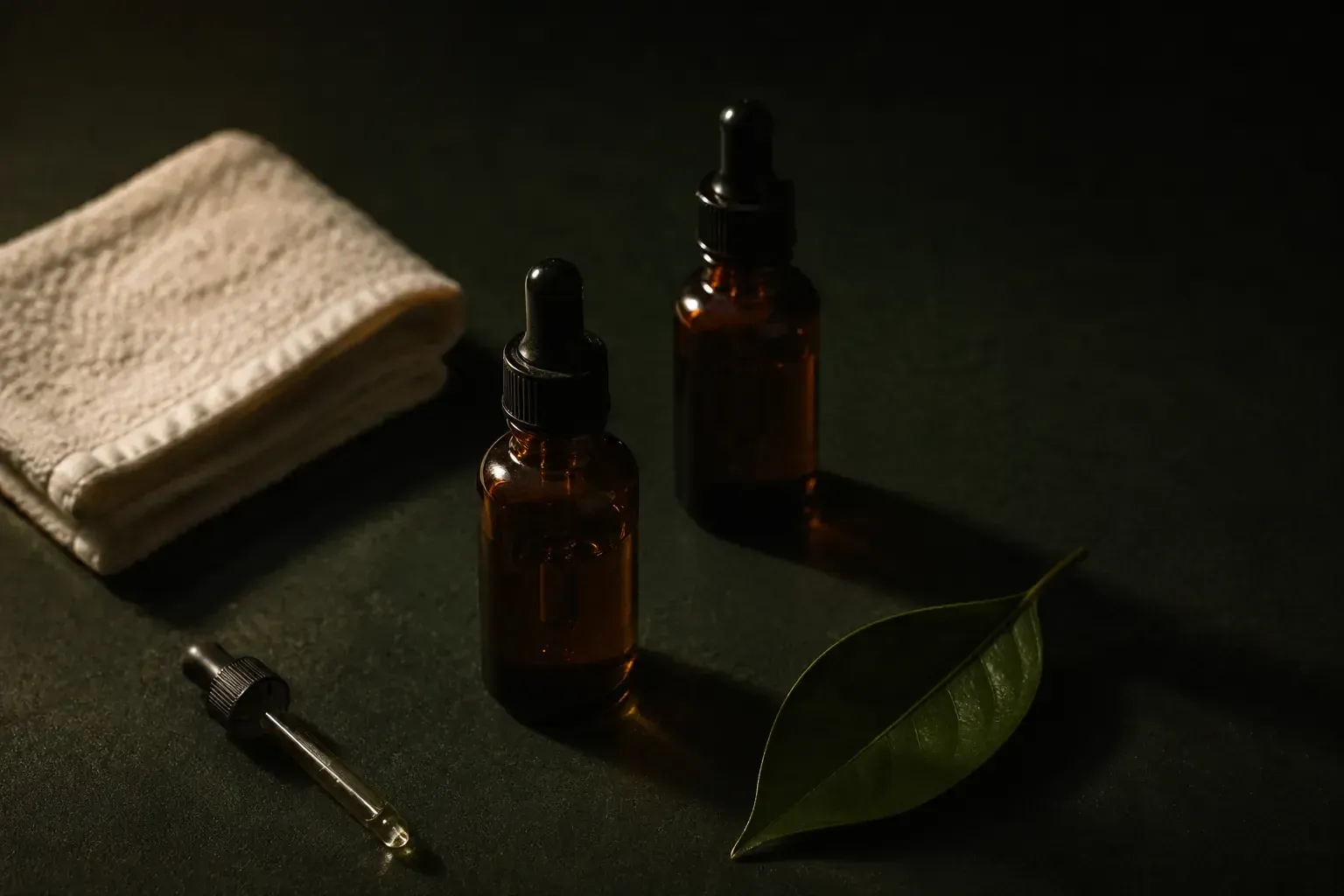
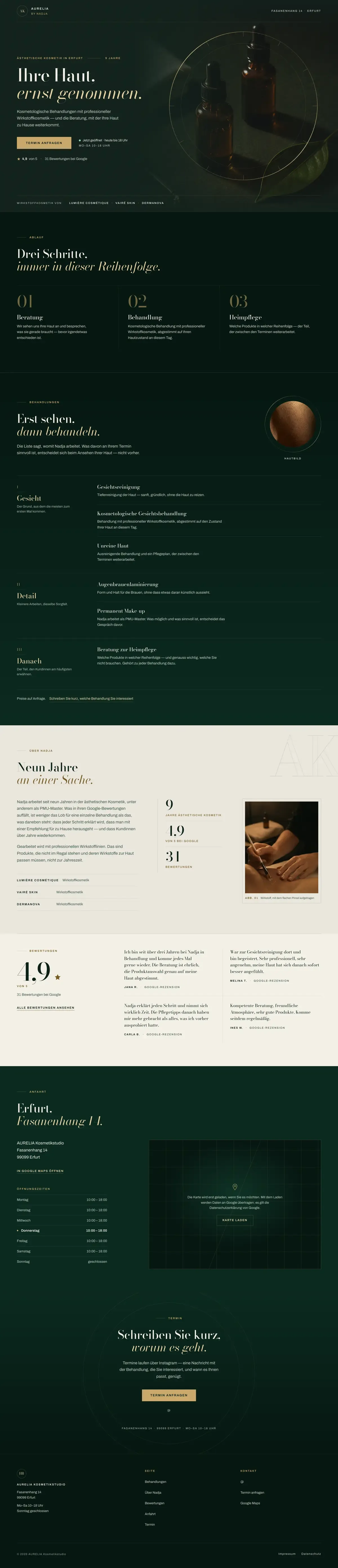
The hero holds the whole scene — amber bottles and a single leaf, lit low and warm, bled off the top, right and bottom edges with the left edge masked so the photograph dissolves into the bottle-green field rather than sitting on it as a rectangle.
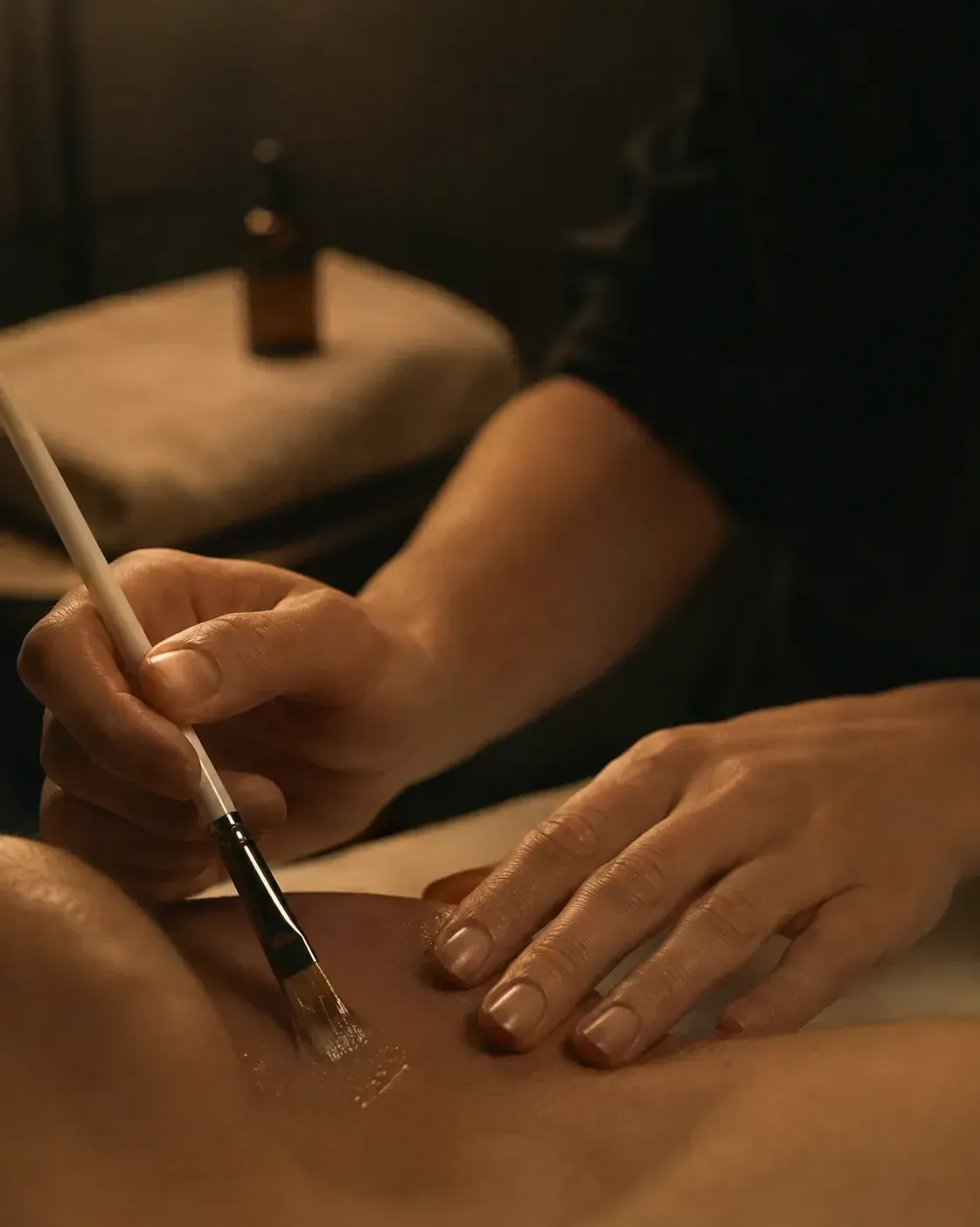
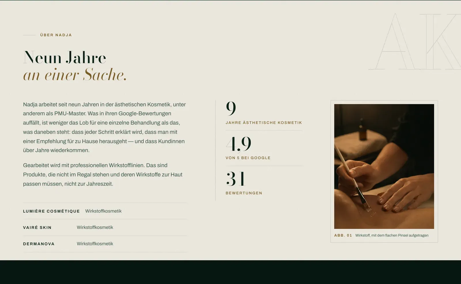
A closer material shot — hands mid-treatment, the same warm light — reused as the studio's own honest proof of craft instead of a generic stock gesture.
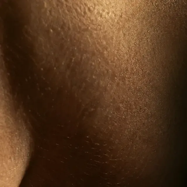
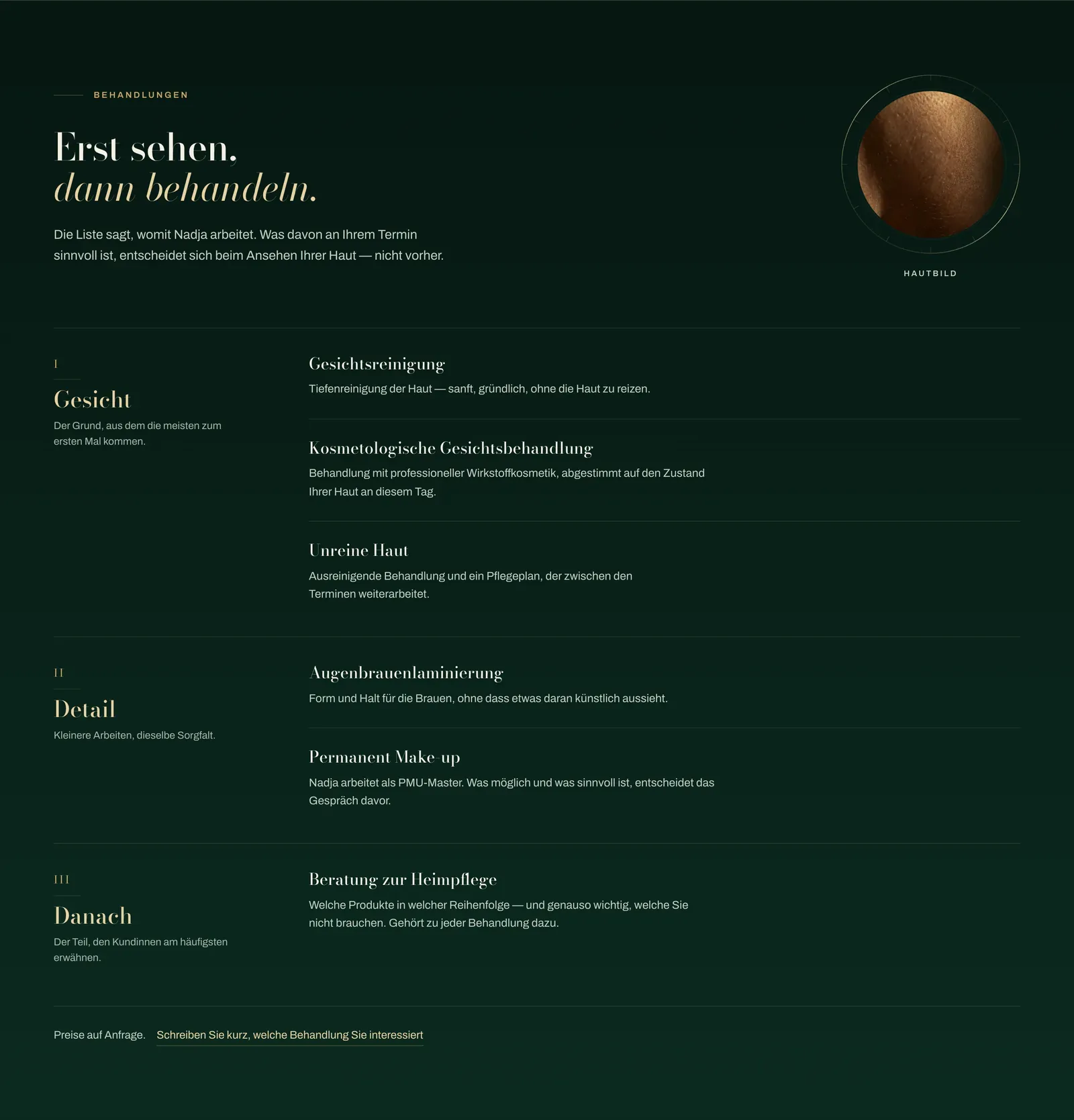
A lit texture detail, cropped square, sitting inside the page's own instrument-bezel ring — the one place a skin-level close-up is allowed, framed like an instrument rather than a clinical macro.
03 Type & Colour
One didone display serif carries every headline with real character — Bodoni Moda across its optical-size axis, hairlines going razor thin exactly where a bottle label's own type would — a quiet grotesque stays out of the way, and gold is held to a single rule: engraving only, filled exactly once.
The ground is a bottle green taken as seriously as a real product's own glass, not a generic dark theme. Gold appears as hairlines, small caps and one instrument bezel — never as a fill except on the primary action. Chalk carries body text on the green; the page turns to warm paper exactly once, in the middle, where a brochure would open.
- Field background, bottle green #0b2a20
- Gold engraving — hairlines & the one fill #c9a86a
- Chalk body text on the green #f4f0e6
- Paper the one warm-paper band, mid-page #f4f0e6
A didone with real hairline contrast at display size, a quiet grotesque that carries every working sentence without competing for attention.
- Aurelia Bodoni Moda Variable · 500 · Wordmark
- Ihre Haut, ernst genommen. Bodoni Moda Variable · 500 · Headline
- ÄSTHETISCHE KOSMETIK IN ERFURT Archivo Variable · 600 · Uppercase label
- Kosmetologische Behandlungen mit professioneller Wirkstoffkosmetik. Archivo Variable · 400 · Body
04 Desktop
The page reads like the studio itself: the claim first, then what actually happens across a treatment, then the range of services in editorial order, then the nine years behind the name, then the proof from her own clients. Nothing is dressed up to look bigger than a one-person studio.
-
01 Behandlungen
Services grouped in three editorial bands — Gesicht, Detail, Danach — each with its own short note instead of a flat price list, so the range reads as expertise, not a menu.
-
02 Über Nadja
The one place the page turns to warm paper — nine years of practice set as data beside a portrait crop, on the label stock the rest of the site is a bottle of.
-
03 Bewertungen
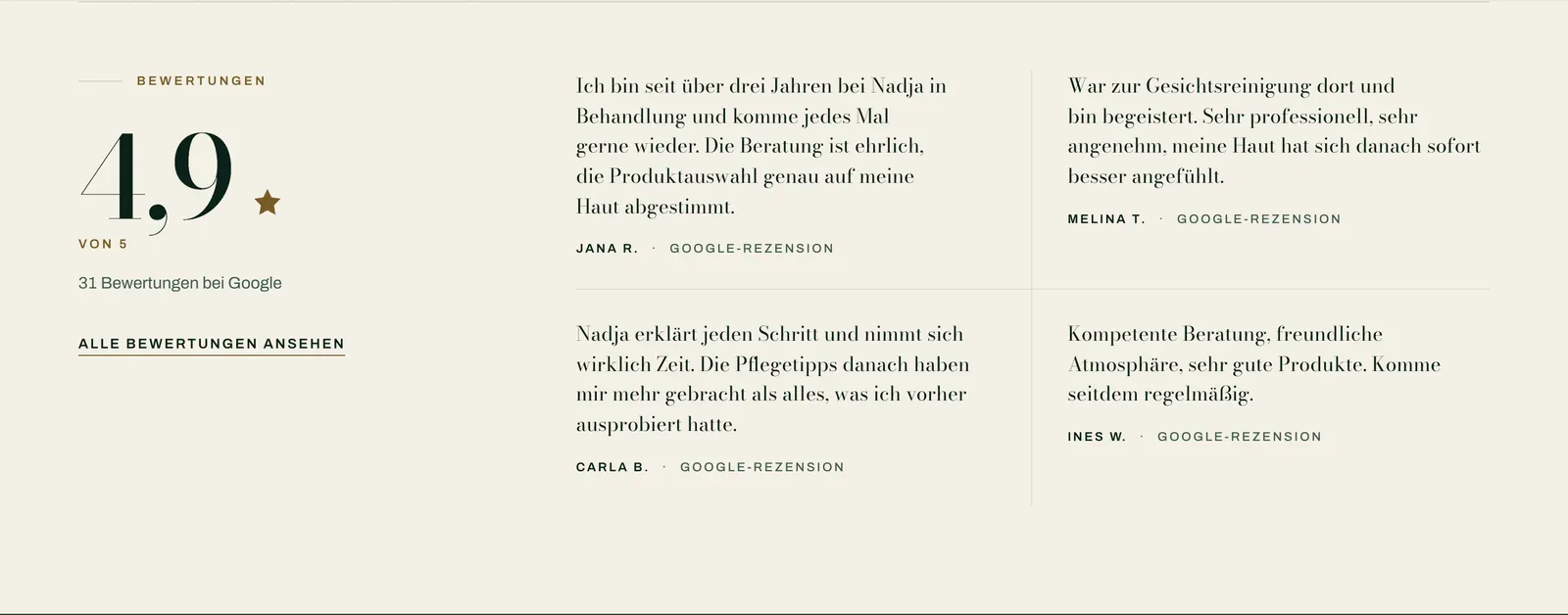
Four real-voiced review quotes on the same warm paper, the aggregate rating set at display size beside them — no stars-only widget standing in for actual sentences.
-
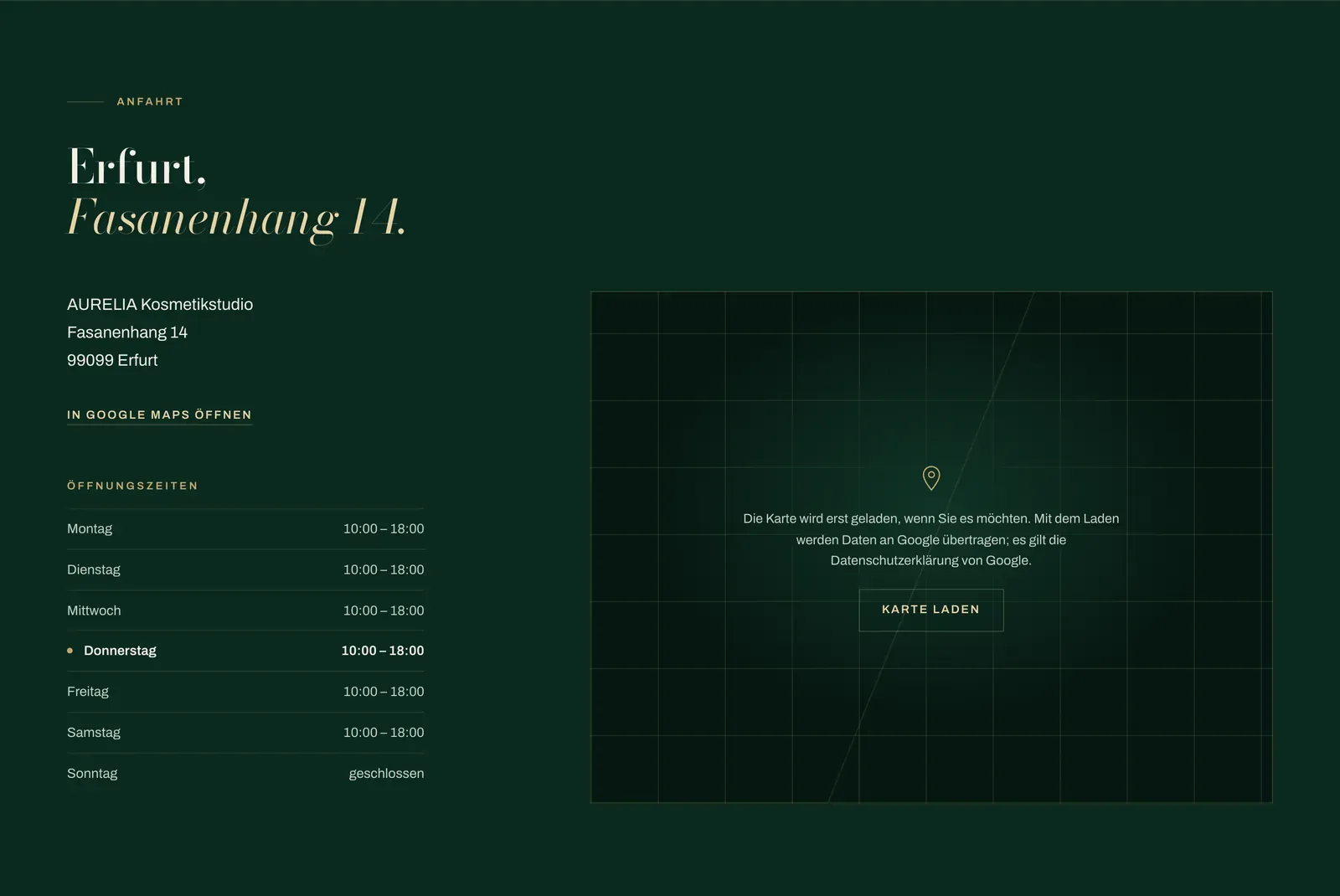
04 Anfahrt
Address and opening hours return to the bottle-green field, a two-click map beside them so nothing loads from Google before consent.
05 Mobile
A cosmetics booking is usually decided on a phone, mid-scroll through a recommendation — the narrow screen keeps the claim, the live open status and the booking button in the first view, before the bottle photograph has even finished settling.
-
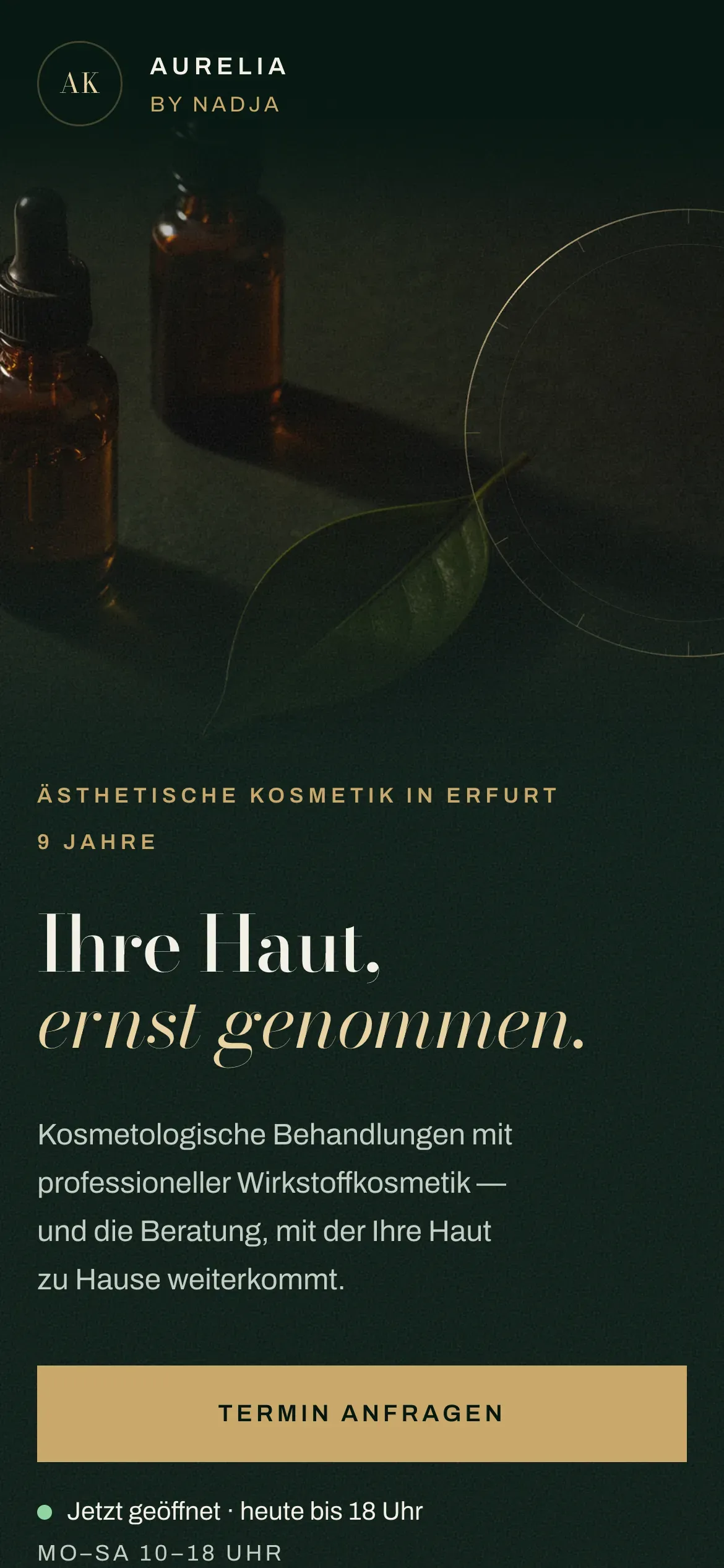
01 Der Einstieg
The still-life becomes a fixed panel above the fold instead of a full-bleed wall — the instrument-bezel ring still reaches across it, so the signature survives the crop.
-
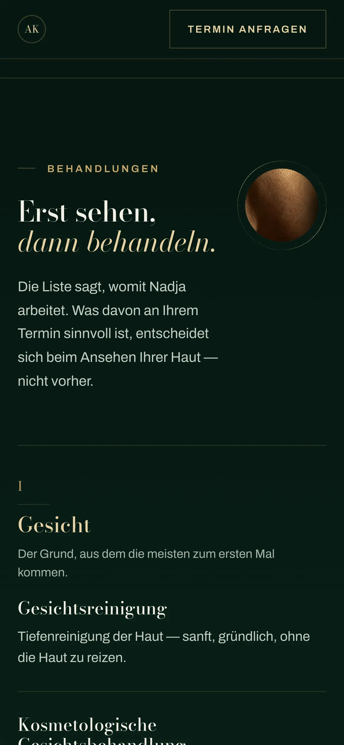
02 Behandlungen
The three service bands stack single-column with every note intact — nothing about the range gets trimmed to fit the width.
-
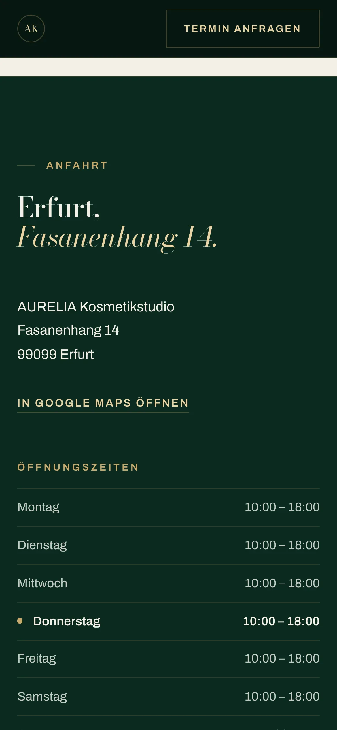
03 Anfahrt
Address and the two-click map sit directly under the studio's own opening hours, so getting there and knowing when to go stay on the same screen.
Same restraint, one thumb — the claim and the button stay first, however far the page runs.
06 The Craft
Aurelia isn't real. The discipline behind it is.
This is how SYNCUP treats a single colour and a single accent as a design system, not a mood board — an apothecary reference interpreted, never copied, and carried all the way to the pixel.
Everything you just scrolled — the bottle-green field taken seriously, gold held to one rule, the paper band exactly where a brochure would open — is what we bring to a real cosmetics or beauty studio. Yours would carry your own colours, your own treatments and your own name.
AURELIA Kosmetikstudio is a fictional studio — a design study by SYNCUP Agency. The studio, its owner, its address and its contact details are invented and don't represent a real business.